The Weekender: Pine green, painting poems, and the evolution of scents
What we’re reading, watching, and listening to this week
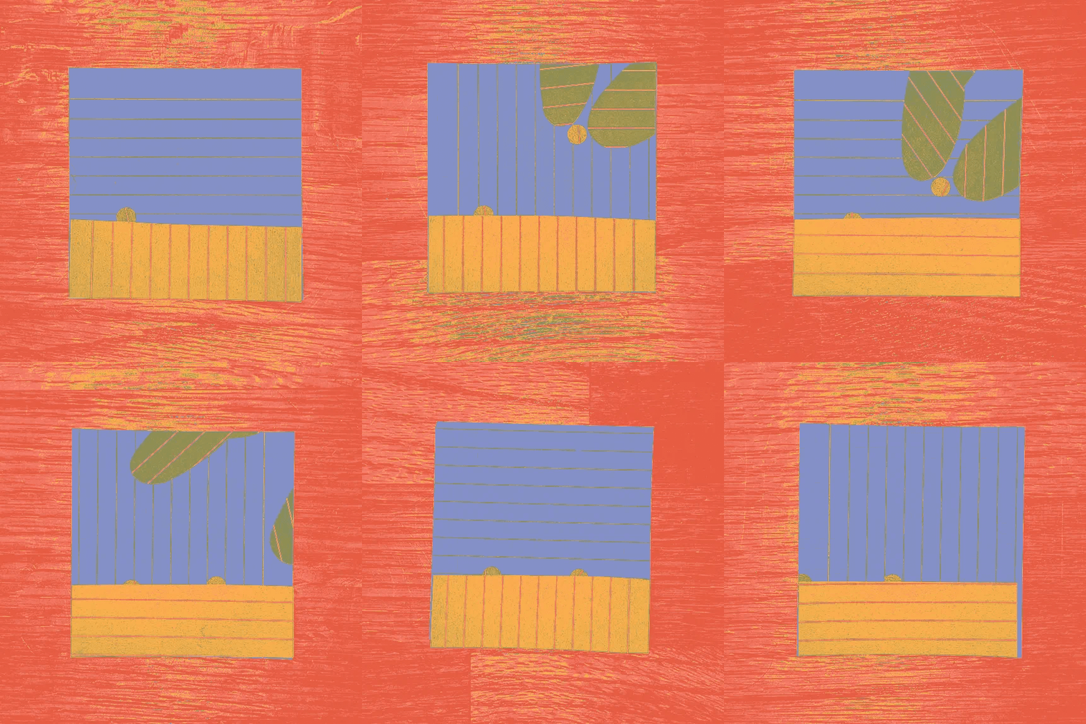
We’re welcoming the new year with a renewed appreciation for lists, an exploration of ekphrastic poetry, and a review of the color that dominated the last year.
CULTURE
A few of our favorite things
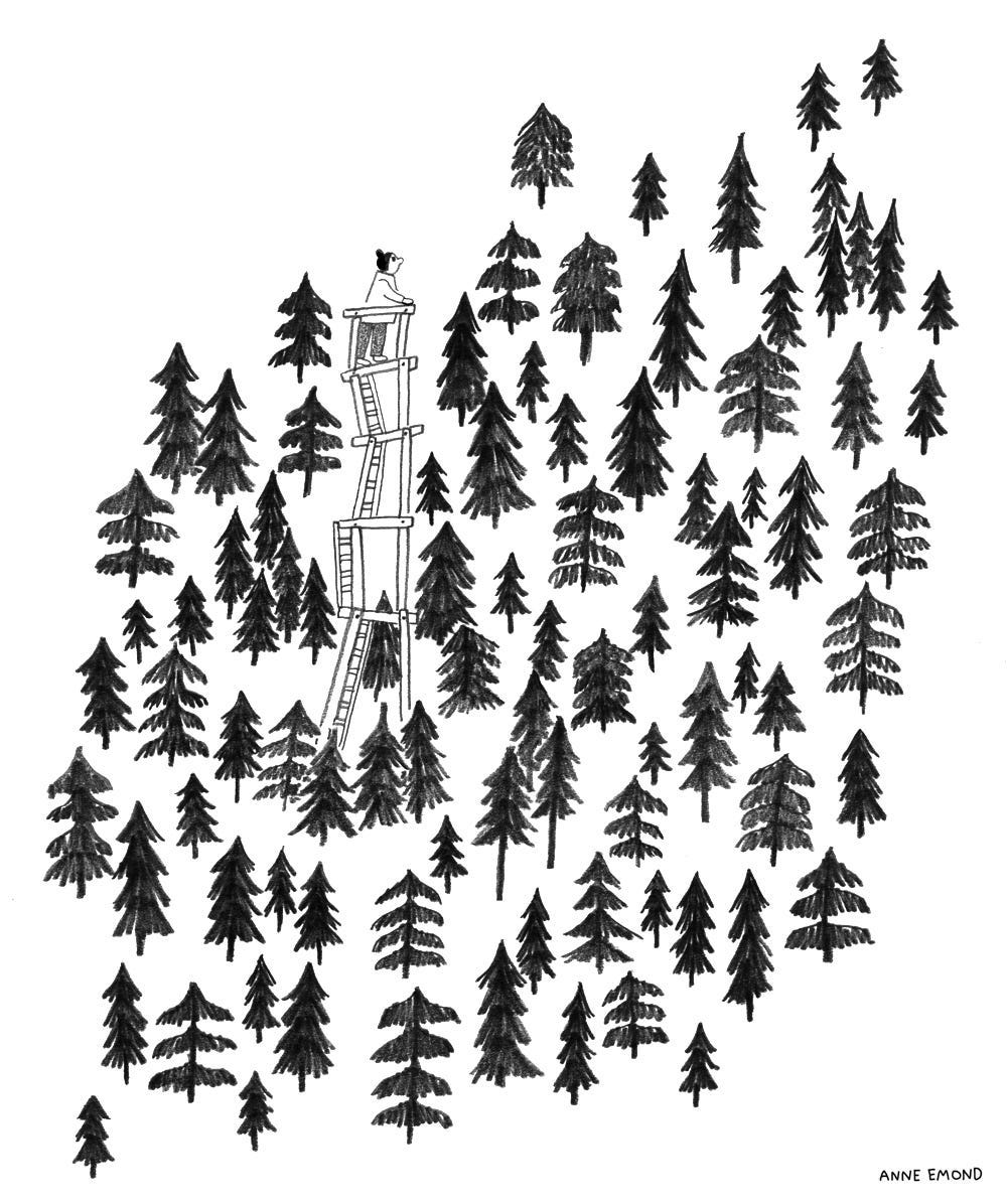
A new year is marked with lists: reflections on the previous year and aspirations for the next. Rather than feeling inundated, Jordan Storm Louise considers the “quiet intimacy” of reading what someone chooses to include.
The intimacy of lists
—
inReading people’s end-of-year lists feels a bit like stepping into a friend’s home for the first time. You notice the bookshelves, filled with authors they’ve loved or long meant to read, the stacks of cosy knitwear and the chipped ceramics that have served countless cups of tea.
Each detail tells a story, about the ordinary moments that mattered enough to be held onto.
This reminds me of my grandfather. When he passed away two years ago, I found a small handwritten shopping list on the kitchen side. Milk, bread, eggs, etc. All written in his familiar hand for a day he never got to see. I kept it in my wallet for a while, until it turned brown and then to dust, a small token of him and the simple world he left behind.
Perhaps it’s my deep sense of nostalgia, but I find a quiet intimacy in the lists of others—each building a portrait of their inner world.
ILLUSTRATION
COLORS
Evergreens
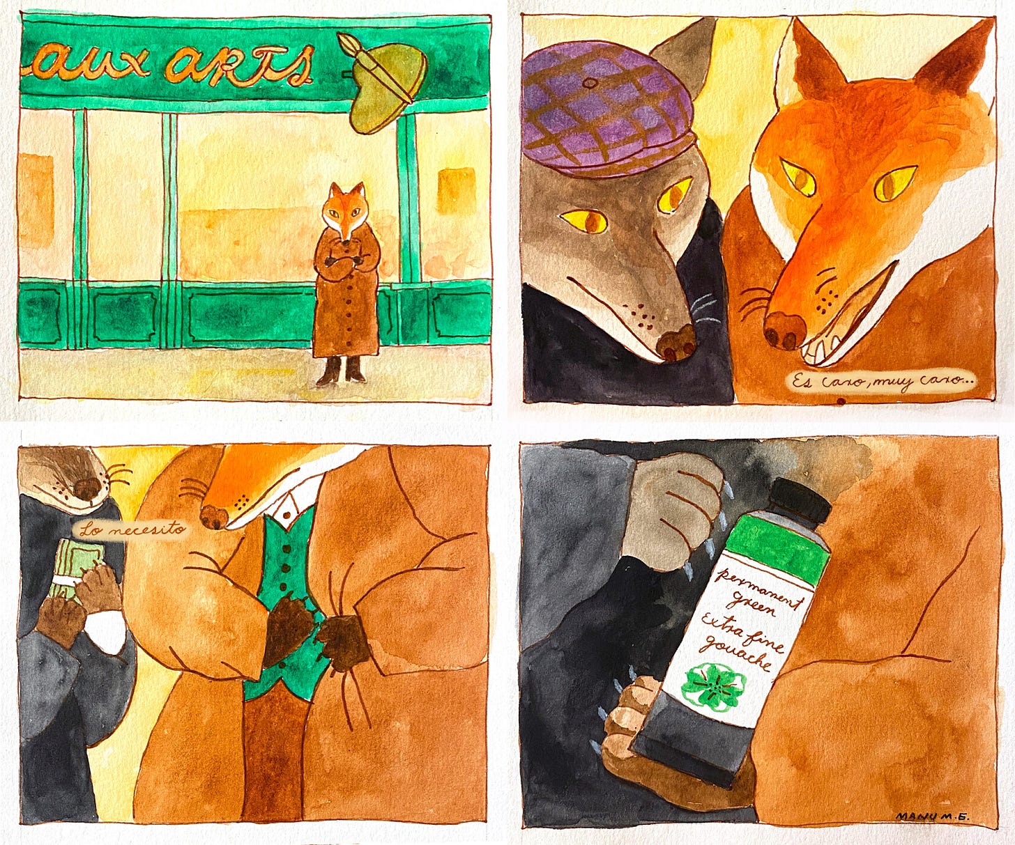
Rather than delve into Pantone’s much-maligned pick for 2025’s color of the year—search “Mocha Mousse” if you dare—we prefer to reflect on the surprise hit of 2024. In this edition of Color Stories, Katy Kelleher considers pine green, a seasonal take on the shade that dominated pop culture over the last year.
The color of 2024: every shade of refusing green
—
in[Last] year, green [was] everywhere. Specifically, lime green, aka “brat green.” But greens, more generally, rose in public esteem, according to Madé Lapuerta at @databutmakeitfashion. “I pulled thousands of online posts referencing green fashion this year and analyzed a combination of sentiment and engagement metrics to compare [average] popularity over time,” explained the blogger. “From olive green to neon green to emerald green … green dominated fashion this year.” In the comments on Instagram, people echoed the sentiment, adding their own analysis to why green might have been so huge. “Also the rise of matcha obsession in Europe!!!” “I wonder how much the release of Wicked played into its popularity,” etc.
While I didn’t see anyone cite The Substance, I think it’s worth mentioning that the “activator” potion in that movie is a toxic, acid green liquid. The director could have made the titular substance a medicinal brown or a nauseating pill yellow, but instead she chose to go the neon route. It’s no less disturbing than those options, but a whole lot more playful.
While I haven’t totally worked this idea out yet, I do think there’s something interesting about how these various trendy greens are all a little rude-coded. The craving for green wasn’t born out of some collective desire to “take a deep breath, oxygenate and reinvigorate” (this is how Pantone marketed Greenery, their 2017 color of the year). Neither the loud, limey green of Charlie XCX’s album cover nor the piney green skin of Elphaba in Wicked are being read as relaxing. They aren’t leafy or soothing, but brash and confronting. Both greens are, in this way, rather vintage. Envious greens, witchy greens, bitchy greens. Maybe even bitter greens.
Initially, I didn’t think of pine as one of those greens. Except once upon a time, all shades of green were considered suspicious. One of my favorite chapters in any Michel Pastoureau color book is about the devilish greens of Europe. Green was the color reserved for witches, ghosts, liars, cheats, the covetous, and the cruel.
Brat green, olive green, even Pantone’s greenery—these are warm greens, dosed with a good amount of butter and brown. Since there are over 100 species of pine, it’s hard to say what, precisely, constitutes pine green. Many retailers seem to consider it a teal-ish color, almost mallard, almost Atlantic. Personally, I think of pine green as being a deep, neutral green, having an excess of neither blue nor yellow, owing a good deal of its poignancy to the presence of black. That makes it far sleepier than brat, and rather sweeter than olive, yet it’s still wilder than teal. Rangier. A camouflage green. A green for long nights and winters.
COMIC
POETRY
Between paintings and poetry
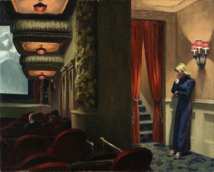
In December, Dorothea Lasky gave a talk on ekphrastic poetry—poetry that describes a work of visual art—at a poetry symposium at the Queens Museum of Art. In this excerpt from the talk, she reviews an Auden poem and the Bruegel painting that inspired it.
Writing in the museum
—
inWhen I think of ekphrastic poetry and writing in museums, I think too of W.H. Auden’s “Musée des Beaux Arts”[:]
About suffering they were never wrong,
The Old Masters: how well they understood
Its human position; how it takes place
While someone else is eating or opening a window or just walking dully along
How, when the aged are reverently, passionately waiting
For the miraculous birth, there always must be
Children who did not specially want it to happen, skating
On a pond at the edge of the wood:
They never forgot
That even the dreadful martyrdom must run its course
Anyhow in a corner, some untidy spot
Where the dogs go on with their doggy life and the torturer’s horse
Scratches its innocent behind on a tree.
In Brueghel’s Icarus, for instance: how everything turns away
Quite leisurely from the disaster; the ploughman may
Have heard the splash, the forsaken cry,
But for him it was not an important failure; the sun shone
As it had to on the white legs disappearing into the green
Water; and the expensive delicate ship that must have seen
Something amazing, a boy falling out of the sky,
Had somewhere to get to and sailed calmly on.
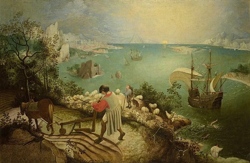
In this poem, Auden plainly narrates how disaffected most humans are to the suffering of others. He narrates this through his poem, the painting, “Landscape with the Fall of Icarus,” by Pieter Bruegel the Elder.
In the painting, we can see the fallen Icarus who famously did not heed the words of his father, who told him to keep an easy course not too close to the burning sun and not too close to the pull of the sea. Instead young Icarus thought he knew better, like the young often do. He flew too close to the sun with his waxen wings and then drowned.
In the painting, we see legs, disembodied, simply splashing as the people of the town go about their day. They are Icarus’s legs, of course, and the splashing his last living movements.
In Auden’s poem we too hear of the “white legs disappearing into the green/ Water.” We hear of the callous “expensive delicate ship that must have seen/ Something amazing, a boy falling out of the sky,/ Had somewhere to get to and sailed calmly on.”
Is that such a truth that Auden wrote of, inspired by the ekphrastic conversation that Bruegel the Elder’s painting has made within him? That aren’t we all just going somewhere anyway, calmly sailing on past most suffering?
I’ve always felt myself most like Icarus, not so great at heeding moderation. But also too aware that when I drowned there would be no one to save me.
Eventually I learned to not want to be saved at all.
What about you? Are you waiting to be saved?
In Bruegel’s painting, we can see the water splashing in white and green brushstrokes. In Auden’s poem, we can hear the splash of Icarus, with not a bang but a whimper, and the sound of the soft bottom of the boat, gliding calmly by.
That’s the essence of Writing in a Museum. A painting’s actions can turn into verse. Something of real life can extend into the space between the two forms.
In Auden’s use of ekphrasis, we can come up to the face of human indifference.
And possibly only the holy conversation between poem and painting allows us to do so.
PHOTOGRAPHY

PERFUME
Signature scents
Brian Buchanan looks at data tracking the frequency of different notes in perfume releases from 1980 to 2024, demonstrating some surprising correlations between broad cultural events and the scents we wear.
Has perfume become samey?
—
inLooking at the graph for the 2020s, it’s clear that that volatility has largely disappeared and the status quo has taken over. With the most popular notes being musk, vanilla/amber and sandal, the prevailing style is likely to be cozy, enveloping and even somatic.
In amongst the normal fluctuations you’d expect from a creative industry, there are four distinct periods when the volatility of perfume notes declined.
One was in 1988, when a new genre appeared from nowhere, bringing about a volte-face from thick and narcotic Florientals to the light water tones of the Aquatic. This caused flattening in the top half of the graph.
A lesser pause happened around the millennium, when angst got a grip of business—causing worries about computers crashing and planes falling out of the sky. Approximately 30% of the graph flatlined between 1999–2004, mostly in the upper half.
In 2015 a new phenomenon appeared where the mid section of the table levelled off while—with the exception of musk—the top and bottom notes became more lively.
And then came Covid 19.
In the four years before 2019, there are 65 movements on the graph. During the year that lockdown swept the world there are ten, and in the four years after Covid, movements nearly halved to 35.
ART
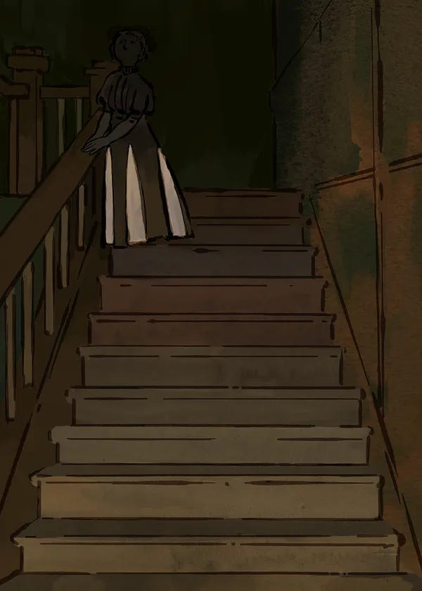
Joyce, illustrated
In a new Substack,
, excerpts sections from classic works and draws the scene. Here, illuminating a quiet moment from James Joyce’s Dubliners.He was in a dark part of the hall gazing up the staircase. A woman was standing near the top of the first flight, in the shadow also. He could not see her face but he could see the terracotta and salmon-pink panels of her skirt which the shadow made appear black and white. It was his wife. She was leaning on the banisters, listening to something. Gabriel was surprised at her stillness and strained his ear to listen also. But he could hear little save the noise of laughter and dispute on the front steps, a few chords struck on the piano and a few notes of a man’s voice singing.
PAINTING
FOOD
Easing into a new year
January is an ascetic month, a reaction against the excesses of December. These PB&J biscuits might help make that transition a bit easier: a “not too sweet” treat filled with fiber, protein, and fresh berries.
PB+J breakfast biscuits
—
inThis is a “sweet” take on two of my most popular savory breakfast biscuit recipes: the Tomato, Basil, and Bacon Breakfast Biscuit and the Rosemary Breakfast Biscuit. You all love these and I’ve received numerous requests for a not-too-sweet (but still kinda sweet 🤣) option that was still packed with protein and fiber.
I’ll admit these feel like a cross between a scone and a biscuit, so call them whatever you want, but know that they are refined-grain-, refined-sugar-free, and I snuck in fiber and protein through flaxseeds, chia or basil seeds, and vanilla protein powder. It tastes like a peanut butter and jelly sandwich, but instead of jelly it uses fresh raspberries!
PAINTING
Substackers featured in this edition
Art & Photography:
, , , , ,Video & Audio:
Writing:
, , , ,Inspired by the writers featured in the Weekender? Creating your own Substack is just a few clicks away:
The Weekender is a weekly roundup of writing, ideas, art, audio, and video from the world of Substack. Posts are recommended by staff and readers, and curated and edited by Alex Posey out of Substack’s headquarters in San Francisco.
Got a Substack post to recommend? Tell us about it in the comments.










new years resolution: ekphrastic conversations
loved this roundup! thanks, y'all!